Evaluation Matters | 2026-06
In this edition
- Building Relationships
- Sunshine and Clarity
- From Findings to Takeaways
- Declaring Independence
About Evaluation Matters
Evaluation Matters is a monthly newsletter published by University of Nevada, Reno Extension. It is designed to support Extension personnel and community partners in building practical skills for evaluating programs, making sense of data, and improving outcomes. Each issue focuses on a key concept or method in evaluation and provides clear explanations, examples, and tools that can be applied to real-world programs.
This issue focuses on four ways to make evaluation findings clearer and more useful: using the Pearson correlation coefficient to describe relationships between variables, using the PICO framework to develop focused evaluation questions, writing evaluation summaries that turn findings into takeaways, and using the chi-square test to examine associations between categorical variables.
Building Relationships
Learn how Pearson’s r describes the strength and direction of relationships between variables.
Father’s Day often reminds us of the relationships that shape our lives. Some relationships are close and familiar, others are more distant, and some change over time. In evaluation, we are often interested in relationships too, not just between people, but between the pieces of information we collect. Do participants who attend more sessions report higher confidence? Are higher knowledge scores associated with stronger intentions to use a new practice? Does satisfaction increase as program dosage increases? The Pearson correlation coefficient, often written as “r”, helps us describe the strength and direction of a relationship between two continuous variables.
Correlation can be utilized when both variables are measured numerically. For example, an evaluator might examine the relationship between number of workshops attended and post-program knowledge score, or between participant age and satisfaction rating. The goal is not to compare groups, but to understand whether two variables tend to move together. When one variable increases, does the other tend to increase or decrease as well? Or do the two variables show no clear pattern at all?
The Pearson correlation coefficient ranges from -1 to +1. A positive correlation means that as one variable increases, the other variable tends to increase, too. A negative correlation means that as one variable increases, the other variable tends to decrease. A correlation close to zero means there is little or no linear relationship between the two variables. The closer r is to either -1 or +1, the stronger the relationship. The sign tells you the direction, while the size of the number tells you the strength.
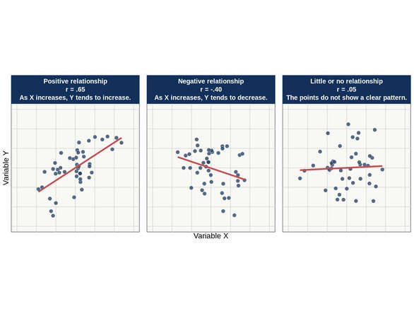
For example, imagine a parenting education program that measures the number of sessions attended and participants’ confidence using novel strategies. If the correlation is r = .65, that would suggest a fairly strong positive relationship: participants who attended more sessions tended to report higher confidence. Now let’s compare parents’ confidence to a different hypothetical metric: number of missed sessions. If the correlation were r = -.40 between number of missed sessions and confidence, that would suggest a moderate negative relationship. Participants who missed more sessions tended to report lower confidence. If the correlation for two variables were r = .05, that would suggest very little relationship between them. In each case, the value of r provides a concise summary of the pattern in the data.
A scatterplot is one of the best ways to understand correlation visually. Each point on the plot represents one participant, program site, county, or other unit of analysis. One variable is placed on the horizontal axis and the other is placed on the vertical axis. When the points form an upward pattern from left to right, the correlation is positive. When they form a downward pattern from left to right, the correlation is negative. When the points look scattered without a clear direction, the correlation is likely weak or close to zero.
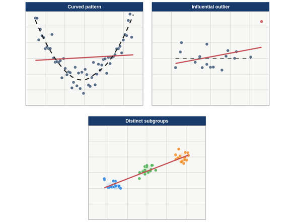
Scatterplots are especially helpful because they can reveal patterns that a single number might hide. A correlation might appear moderate overall, but the scatterplot could show that the relationship is driven by one unusual point. It might show a curved relationship, where the variables are related but not in a straight-line pattern. It might also show separate clusters, suggesting that the relationship differs across groups. Before relying too heavily on r, it is always wise to look at the plot and ask whether the number tells the full story.
It is also important to remember that correlation does not prove causation. Just because two variables move together does not mean one caused the other. Participants who attend more sessions may have higher confidence, but that does not necessarily mean attendance alone caused the increase. Those participants may have started out more motivated, had more time available, or received additional support outside the program. Correlation can point to meaningful relationships, but it cannot rule out other explanations by itself.
Like any good relationship, correlation works best when it is understood in context. The number alone is not enough. Evaluators should consider the size and direction of the relationship, examine the scatterplot, think about whether the variables were measured well, and interpret the finding alongside program knowledge. When used thoughtfully, the Pearson correlation coefficient helps evaluators describe how two variables are connected and opens the door to better questions about why those patterns may exist.

The Pearson correlation coefficient describes how closely two continuous variables move together.
Sunshine and Clarity
Use PICO to turn broad ideas into focused, answerable questions.
June brings longer days, brighter skies, and more opportunities to see things clearly. Evaluation planning benefits from that same kind of clarity. Before choosing a survey, building a spreadsheet, or deciding which statistical test to run, evaluators need to know what they are trying to find out. A focused question gives the evaluation direction by identifying the issue, population, outcome, or decision that matters most.
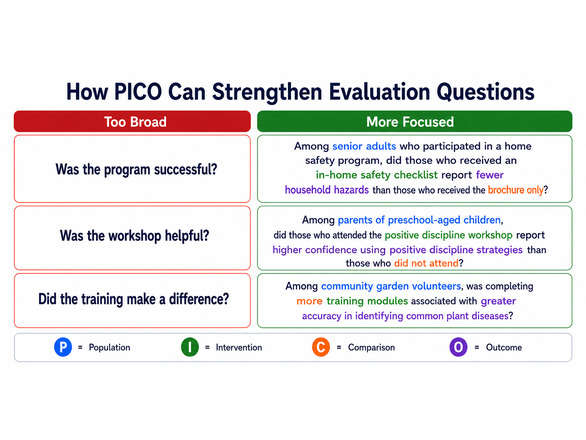
A strong evaluation question should be specific, answerable, and connected to a real decision or learning need. Vague questions often lead to vague data. For example, “Did the program work?” may be too broad to guide useful evaluation planning. A more focused question might ask, “Did participants report increased confidence in using food budgeting strategies after completing the workshop?” This version identifies the audience, the outcome, and the point of comparison. It gives the evaluator a clearer path from question to data collection to interpretation.
One useful framework for developing focused questions is PICO. PICO is often used in health and applied research, but it can also help evaluators think carefully about what they want to measure. The letters stand for Population, Intervention, Comparison, and Outcome. Population identifies who the evaluation is about. Intervention identifies the program, service, or activity being examined. Comparison identifies what the program is being compared against, when relevant. Outcome identifies the change, condition, or result of interest.
For example, an Extension team evaluating a nutrition education program might use PICO to clarify its question. The population could be adults participating in a county-based workshop series. The intervention could be a four-week nutrition education program. The comparison might be participants’ knowledge before the program, or a similar group that did not attend. The outcome could be nutrition knowledge, confidence in meal planning, or reported vegetable intake. A PICO-style question might then be: ‘Did adults who completed the four-week nutrition education series show an increase in nutrition knowledge from pre-test to post-test?’.
Not every evaluation question needs all four PICO elements, especially when there is no comparison group. Still, the framework encourages evaluators to think carefully about the pieces of the question. Who are we studying? What program or activity are we evaluating? What are we comparing it to, if anything? What outcome matters most? Even when the final question does not include every PICO element explicitly, using the framework behind the scenes can prevent confusion later in the process.
It is also helpful to distinguish descriptive questions from inferential questions. Descriptive questions summarize what happened, who participated, what people reported, or what patterns appeared in the data. For example, “How many participants completed the program?” and “What percentage of participants reported high satisfaction?” are descriptive questions. These questions are valuable because they help document reach, participation, and observed outcomes.
Inferential questions go a step further. They ask whether an observed difference, change, or relationship is likely to reflect a meaningful pattern rather than normal variation. Questions like “Did knowledge increase significantly from pre-test to post-test?” or “Are satisfaction scores different across program sites?” require statistical testing. These questions often involve comparison, uncertainty, and evidence beyond simple description.
Developing clear evaluation questions can also help protect evaluation work from becoming too large or unfocused. It is important to remember that every additional question adds time for participants and complexity for analysis. Focused evaluation questions help teams decide what information is essential and what can be left out.
From Findings to Takeaways
Learn how to write clear evaluation summaries that highlight findings and next steps.
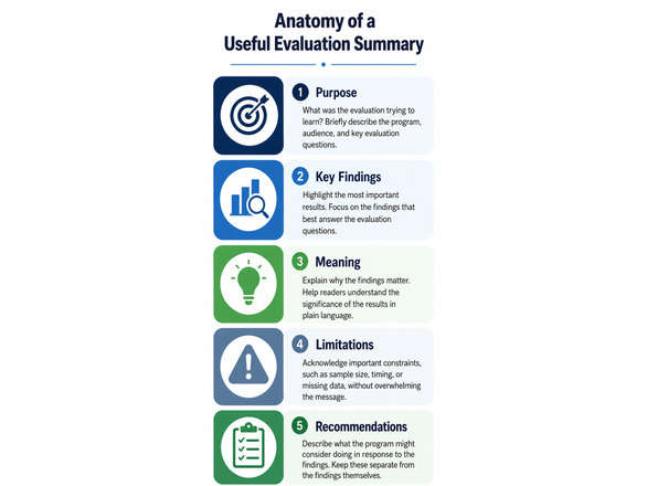
At the end of a program year, evaluation results often need to move quickly from analysis to action. Stakeholders, program leaders, and funders may not have time to read a full report closely, but they still need to understand what was learned and why it matters. A strong evaluation summary helps bridge that gap. It brings together the most important findings, explains their meaning in plain language, and points readers toward useful next steps. The goal is not simply to “write a short report”, but to help people use the information it contains.
An evaluation summary should begin with the purpose of the evaluation. Readers need to know what the program wanted to accomplish and what questions the evaluation was designed to answer. This does not require a long background section, but it does require enough context for the findings to make sense. A useful opening might briefly describe the program, who participated, what outcomes were measured, and why the evaluation was conducted. Without this foundation, even strong findings can feel disconnected from a larger story.
After establishing the purpose, the summary should present the most important findings clearly and directly. This is where evaluators need to resist the urge to include every table, statistic, and detail from the full report. Stakeholders often need the main takeaways first, especially when they are making program or funding decisions. A strong summary highlights the findings that matter most, explains what they mean, and connects them back to the evaluation questions. If a finding does not help answer the main question, it probably belongs in the full report rather than the summary.
Plain language is essential. Evaluation summaries are often read by people with different levels of statistical training, program familiarity, and available time. Terms like “statistically significant,” “response rate,” or “effect size” may be important, but they should be explained in a way that supports understanding. The goal is not to remove technical information, but to translate it so readers can understand what the result means.
A clear evaluation summary should also separate findings from recommendations. Findings describe what the evaluation showed. Recommendations explain what the program might do in response. Keeping these pieces distinct helps readers understand the difference between evidence and interpretation. For example, “participants reported difficulty accessing evening sessions” is a finding, while “consider offering at least one virtual or daytime option next year” is a recommendation. Both are useful, but they serve different purposes.
Good summaries also acknowledge limitations without letting them overwhelm the message. Every evaluation has constraints, whether related to sample size, response rate, missing data, measurement, timing, or design. Naming these limitations builds trust and helps readers interpret findings appropriately. However, limitations should not be written as apologies or as reasons to dismiss the entire evaluation. A balanced summary explains what the findings can support, what they cannot fully answer, and where additional information may be needed.
Visuals can strengthen an evaluation summary when they are simple and purposeful. A short table, bar chart, or callout box can help readers quickly understand a key result. However, visuals should not be decorative filler. Each one should answer a question, clarify a finding, or make a comparison easier to understand. A strong chart title can do some of the communication work by stating the main takeaway rather than simply naming the data. For example, “Participants Report Increased Confidence After the Workshop” is more useful than “Confidence Results.”
The closing section of an evaluation summary should help the reader understand what comes next. This might include a short list of recommended next steps, questions for future evaluation, or decisions the findings can inform. Rather than ending with a final statistic or a vague statement of success, the summary should connect the findings back to program improvement. What should the team continue, adjust, or examine more closely next year? When written clearly, an evaluation summary can help a program celebrate what worked, understand what needs improvement, and move forward with stronger direction.
Declaring Independence
See how chi-square tests for associations between categorical variables.
This July, let’s celebrate Independence Day by discussing one of the foundational tests in statistics: the chi-square test of independence. The name is fitting, not just because of fireworks and barbecues, but also because the test helps evaluators determine whether two categorical variables are independent or appear to be associated. For example, is preferred program format related to age group? Does satisfaction differ across program sites? Is program completion associated with participation type? When two variables describe categories rather than numerical scores, the chi-square test can help determine whether an observed pattern is likely to reflect more than random variation.
The chi-square test also has a fitting historical connection to July. Karl Pearson introduced the chi-square framework in a landmark paper published in July 1900. Although his original work focused on comparing observed data with the pattern expected under a statistical model, one common application today is the chi-square test of independence. More than a century later, it remains an important tool for examining patterns in categorical data.
Unlike Pearson’s r, which examines the relationship between two continuous variables, the chi-square test of independence is used when both variables are categorical. Categorical variables place observations into groups or classifications, such as program site, participation status, preferred learning format, satisfaction category, county, or yes/no responses. The data are organized in a contingency table, sometimes called a cross-tabulation, which shows the number of observations in each combination of categories.
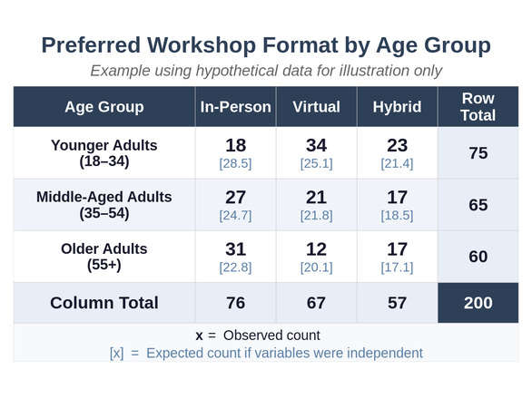
Imagine an evaluation examining whether preferred workshop format is associated with age group. Participants are categorized as younger adults, middle-aged adults, or older adults, and each person identifies a preference for in-person, virtual, or hybrid programming. The accompanying contingency table shows the observed number of participants in each combination of age group and workshop format, along with the expected count in brackets. Apparent differences may be visible in the table, but the chi-square test helps determine whether those differences are larger than we might reasonably expect from random variation alone.
The test compares observed counts with expected counts. Observed counts are the numbers actually found in the data, while expected counts represent the pattern we would anticipate if age group and workshop preference were unrelated. Rather than assuming that every cell should contain the same number of people, the expected counts reflect the overall distribution of both variables. Because in-person workshops were preferred by a little more than one-third of all participants, we would expect a similar proportion of each age group to prefer that format if the variables were independent. The expected counts preserve the same row and column totals as the observed data, but redistribute the counts across the cells according to that expected pattern. The chi-square statistic then summarizes how far the observed counts differ from those expectations.
The resulting p-value helps determine whether those differences provide evidence of an association. A statistically significant result, typically a p-value below .05, suggests that the variables are unlikely to be independent. A non-significant result indicates that the available data do not provide sufficient evidence of an association.
Statistical significance does not tell us whether an association is important in practice. With a very large sample, even small differences may produce a statistically significant result. Evaluators should examine the percentages in the contingency table, consider the practical meaning of the differences, and interpret the findings within the program context. Effect size measures, such as Cramér’s V, can also help describe the strength of an association.
The chi-square test also depends on appropriate data conditions. Each observation should contribute to only one cell of the table, and expected counts should be large enough for the chi-square approximation to work appropriately. As a general guideline, no expected count should be below 1, and no more than 20% should be below 5. When these conditions are not met, categories may sometimes be combined when conceptually appropriate. For small contingency tables, particularly 2 × 2 tables, Fisher’s exact test may be a better option.
The chi-square test provides a structured way to compare observed patterns with what we would expect if the variables were independent. When paired with careful examination of the contingency table, an appropriate measure of association strength, and knowledge of the program context, it can help evaluators move beyond simple counts toward a better understanding of how categorical characteristics may be connected.
Published by:
Copp, C. & Elgeberi, N., 2026, Evaluation Matters | 2026-06, Extension, University of Nevada, Reno, Newsletter
An EEO/AA Institution. Copyright © 2026, University of Nevada Cooperative Extension.
A partnership of Nevada counties; University of Nevada, Reno; and the U.S. Department of Agriculture