Evaluation Matters | 2025-06
In this edition
- Weeding Your Data: Catching Errors Before They Get Out of Control
- The Right Plant in the Right Place: Choosing the Right Average for Your Data
- Getting to Know Your Data! The Power of Simple Descriptives
About Evaluation Matters
Evaluation Matters is a monthly newsletter published by University of Nevada, Reno-Extension. It is designed to support Extension personnel and community partners in building practical skills for evaluating programs, making sense of data, and improving outcomes. Each issue focuses on a key concept or method in evaluation and provides clear explanations, examples, and tools that can be applied to real-world programs.
This issue, published in June 2025, covers techniques for cleaning messy datasets, choosing the right average to summarize data, and using simple descriptives like counts and percentages to guide your early analysis. Just like a well-tended garden, your evaluation work thrives when your data is clean and organized.
Weeding Your Data: Catching Errors Before They Get Out of Control
Simple strategies to identify and fix data entry issues before analysis begins.
A messy dataset can quietly undermine your analysis, much like weeds in a garden that compete with the plants you’re trying to grow. Even small entry errors, if left uncorrected, can distort your results, create misleading summaries, or disrupt your analyses entirely. Because data analysis depends on structure and consistency, it’s important to catch these issues before they become unmanageable.
Start with the basics: make sure your spreadsheet is organized so that each row represents one unit of analysis. This could be a survey participant, a classroom, a product, or a date. Similarly, each column should be dedicated to a single type of variable, such as a ZIP code, a satisfaction rating, or a timestamp. When rows or columns serve multiple functions or change midstream, it becomes very difficult to draw reliable conclusions or perform structured analyses.

Cleaning your dataset is like maintaining a garden!
Next, examine your value coding for consistency. For example, if you are using a survey platform like Qualtrics, you can recode your response values so that “Strongly Agree” is coded as a 5 across all items that use that scale. Similarly, if you have multiple yes/no questions coded using ones and zeroes, all the “yes” responses should be represented by the same number, and all the “no” responses should as well.
Typos are another common issue, especially in manually entered data. An easy way to scan for these is by opening the data in Excel and applying filters to the columns. Clicking the column dropdown will show every unique entry, allowing you to quickly spot errors like “Nevda” instead of “Nevada”, or leading or trailing spaces that create unintended categories. Once spotted, Excel’s Find and Replace tool can correct these in just a few clicks.
Inconsistent formatting can also cause trouble. If one cell records a date as “2025-06-16” and another uses “16-Jun-25,” your software might treat them as different data types. Choose one format and apply it uniformly across the column. This applies to numbers as well. The number 20250616 could be a date (timestamp), a customer number (nominal), or even a measure of revenue (numeric). These distinctions matter, and your formatting should make them clear and consistent.
Misplaced values are another common error. Common examples include a header row that has been sorted into the rest of the data or a column accidentally pasted into the wrong location that shifts every value over by one column. In this latter case, you might see a year of birth under “ZIP Code” or a state listed under “First Name.” These structural issues can be spotted by reviewing column-level summaries. If a numeric field suddenly shows text, something is off. Looking at the summary data by using a pivot table or a histogram can quickly highlight these inconsistencies.
Taking time to weed out problems in your data early on helps prevent larger issues during analysis. A little regular upkeep goes a long way toward keeping your dataset in good shape for whatever you have in store for it!
The Right Plant in the Right Place: Choosing the Right Average for Your Data
Explore how mean, median, and mode can each tell a different story.
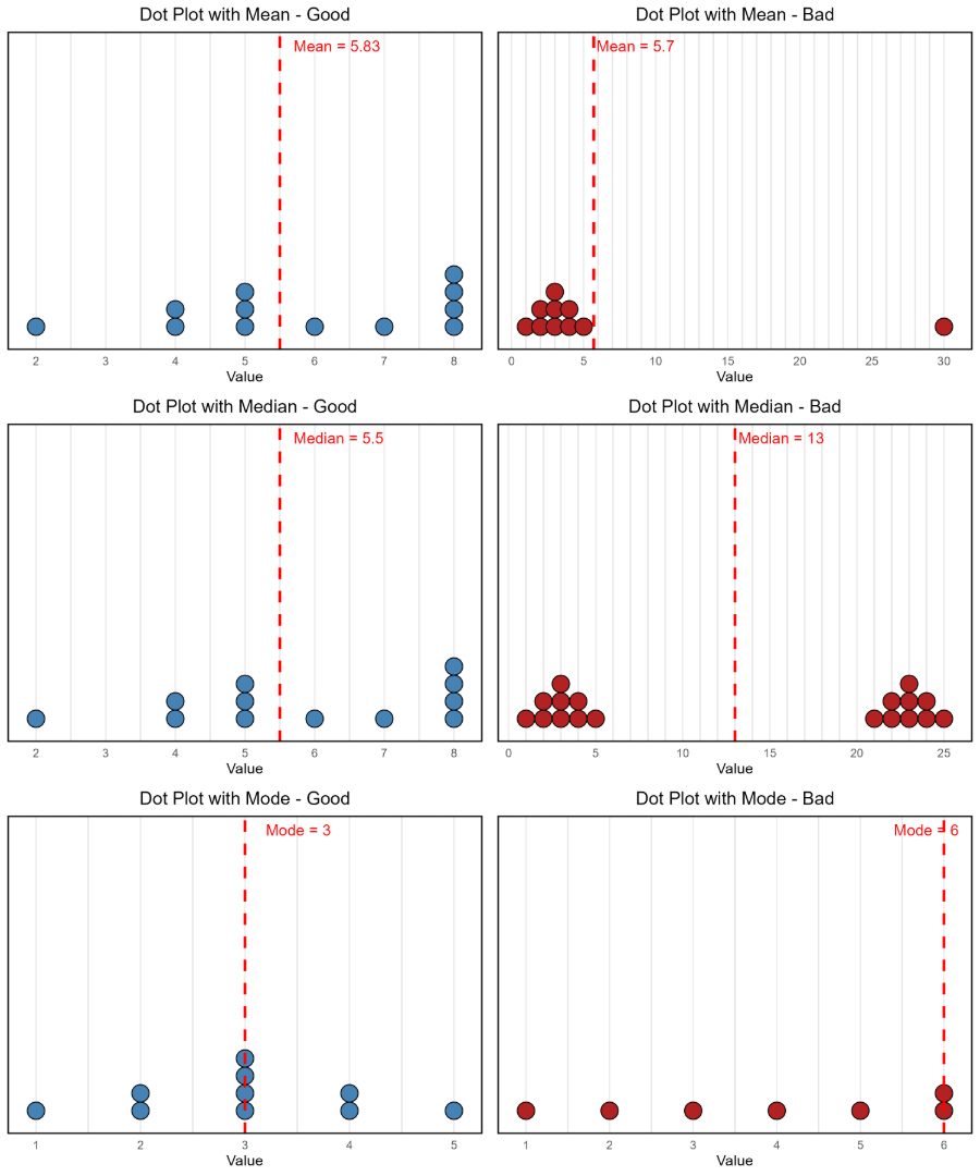
Good gardeners know that success starts with choosing the right plant for the right conditions. A cactus won’t survive in soggy soil, and a fern will wither in the desert sun. Averages work the same way. The mean, median, and mode each respond differently to the environment of your data, and selecting the wrong one can lead to subpar results.
The mean, or arithmetic average, is the most commonly used summary statistic. It works best when your data is relatively symmetrical and free of extreme values. You calculate it by adding all the values and dividing by the number of entries (Formula: Mean = Σx / n, where Σx is the sum of all values and n is the number of entries). However, the mean is highly sensitive to outliers. For example, Warren Buffett and I have an average net worth of around 152 billion dollars. In datasets where the values vary dramatically, the mean can obfuscate important underlying patterns in your data.
When data is skewed, the median is often a better fit. The median is the middle value when data is ordered from smallest to largest. It is especially helpful when summarizing things like income, housing prices, or test scores, where a few extreme cases can heavily influence the mean. The median provides a clearer picture of what is typical, but it does not account for the size of differences above or below that midpoint, which can limit its usefulness when comparing groups with similar medians but different distributions.
The mode is the most frequently occurring value in a dataset. It can offer insight into what is most common, especially in numeric contexts. For example, if you are analyzing how many books people read in a year and the most frequent answer is 2, that may tell you more about typical behavior than the mean or median. Still, the mode can be misleading. The most popular vehicle in the U.S. in 2024 was the Toyota RAV4, yet the modal number of RAV4s owned by U.S. citizens is zero. Likewise, although millions voted in the 2024 election, the most common response to the election was not voting at all. In cases like these, the mode reflects a lack of action rather than a useful summary.
Each of these summary statistics answers a different question. The mean shows the average of all numbers, the median highlights the midpoint of all numbers, and the mode reveals the most common of all numbers. None is universally best, and in some cases, a single number can mask important variation in your data. An average score in the middle of your range might reflect a group who all responded neutrally, or it might hide a split between very high and very low responses. Rather than picking one by default, think about the most meaningful metric to relay useful information to your audience.
Additionally, each of these statistics might also have limitations depending on the shape of your data. As shown in the accompanying examples below, the mean can be pulled away from the rest of the data by a single extreme value, resulting in a misleading summary. The median may fail to reflect meaningful patterns when your data has multiple peaks, such as in a bimodal distribution where two distinct groups exist. Similarly, the mode can be uninformative when the data is relatively flat or evenly spread across values, making the most frequent value less meaningful in describing the overall dataset.
Choosing the right average is a lot like selecting the right plant for your region. When you match your choice to the story you want to tell, your findings are more likely to take root and thrive in the mind of your audience.
Getting to Know Your Data! The Power of Simple Descriptives
Use counts and percentages to uncover what’s happening early on.
The first bite of a homegrown tomato doesn’t tell you everything about your garden, but it can tell you a lot! It gives you a sense of how the growing season is going, whether conditions were right, and whether your efforts are beginning to pay off. Descriptive statistics work the same way. Before diving into deep analysis, these simple summaries let you take a first taste of your data to understand what’s taking shape.
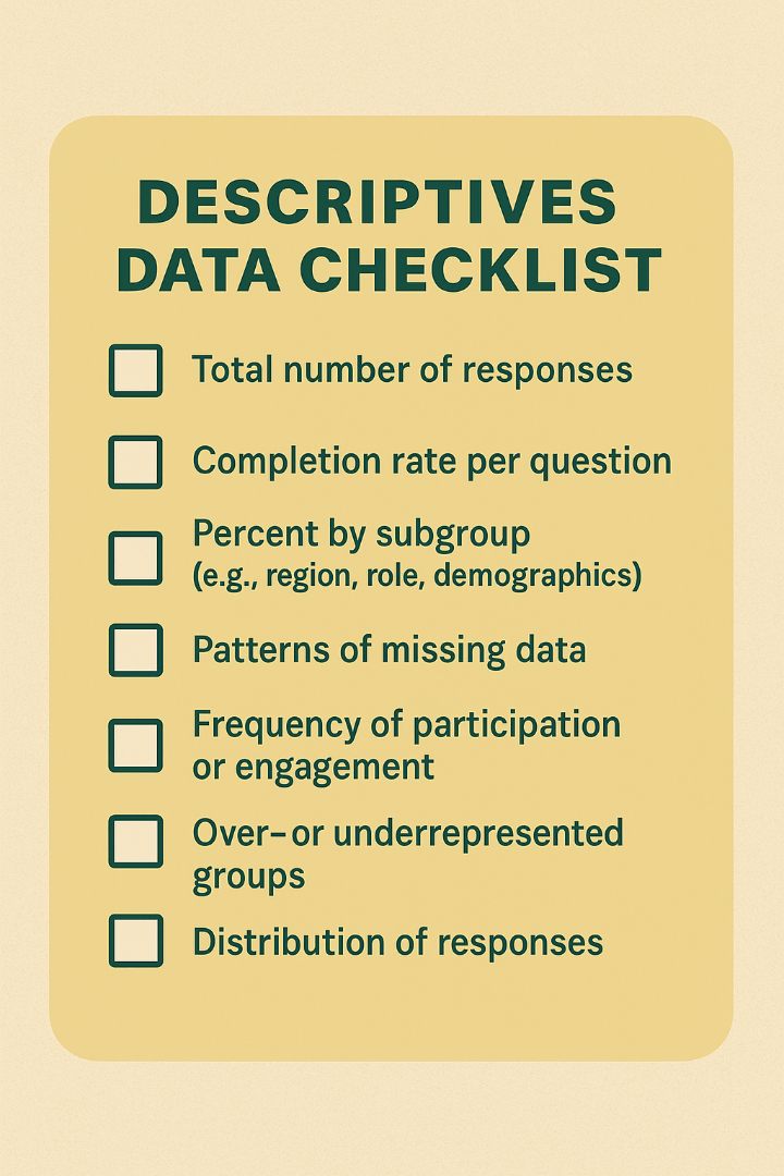
Start with basic counts. How many people responded to your survey? How many skipped it? How many responses came from each region or over each day? These totals give you a quick sense of completeness and coverage. If only 24 people responded to a training attended by 400, your interpretation of the results might change significantly with additional data. This kind of basic tallying helps you understand the scale and boundaries of your dataset.
Next, look at proportions. Percentages can make patterns clearer and more comparable, especially when group sizes differ. For example, if 52 percent of respondents preferred in-person training, that proportion tells you more than a raw count of participants. If 80 percent of respondents came from one county and only 5 percent from another, that imbalance might shape how you interpret the feedback. Proportions help you judge whether your sample reflects your target population, or whether your data has important gaps that should be acknowledged.

Piloting your survey!
Missing or inconsistent data can also be spotted quickly through descriptives. Are there questions with far fewer responses than others? That might suggest confusion, sensitivity, or disengagement. Are certain groups underrepresented? For example, if 90 percent of respondents are from urban centers, rural perspectives may be absent. Similarly, if men comprise the majority of your respondents, female perspectives might be just what your study needs! These issues don’t always require complex analysis to identify… just a careful look at your initial counts and percentages.
You can also use descriptives to explore patterns of behavior. Did most people attend all sessions, or drop off halfway through? How many participants engaged more than once? Tabulating attendance, frequency, or drop-off rates can help you understand participation trends, even before outcome analysis begins.
Descriptive statistics may not be flashy, but they are the first taste of what your data has to offer. Like an early bite of summer produce, descriptives let you know whether you’re on the right track, or whether something may need adjusting before digging deeper.
Published by:
Copp, C. & Elgeberi, N., 2025, Evaluation Matters | 2025-06, Extension, University of Nevada, Reno, Newsletter
An EEO/AA Institution. Copyright © 2026, University of Nevada Cooperative Extension.
A partnership of Nevada counties; University of Nevada, Reno; and the U.S. Department of Agriculture