Evaluation Matters | 2026-04
In this edition
- Seeing the Pattern
- Don’t Be Fooled!
- Count Your Eggs
About Evaluation Matters
Evaluation Matters is a monthly newsletter published by University of Nevada, Reno Extension. It is designed to support Extension personnel and community partners in building practical skills for evaluating programs, making sense of data, and improving outcomes. Each issue focuses on a key concept or method in evaluation and provides clear explanations, examples, and tools that can be applied to real-world programs.
This issue focuses on three ways to get more from your evaluation data: using visualizations such as polar charts to reveal patterns, understanding the different types of validity so your measures capture what they are intended to measure, and planning sample size so your study has the statistical power to detect meaningful results.
Seeing the Pattern
Learn how data visualization can make complex findings easier to understand by revealing patterns that otherwise might be missed.
You might not know it, but the plot above is famous. In April of 1858, Florence Nightingale used a polar area chart to communicate a pattern that had been difficult for others to grasp from tables of numbers alone. During the Crimean War, many people assumed that most soldiers were dying from battle wounds. Nightingale’s analysis showed that disease and poor sanitary conditions were a much larger cause of death, and she needed a way to make that reality visible to decision-makers who might not study rows of figures closely.
She had access to detailed records, including counts of deaths and their causes. The challenge was not collecting the information, but presenting it in a form that made the pattern easy to see. A table could include the same numbers, but the reader would need to work through the values to piece together the larger story. By arranging the information visually, Nightingale made the pattern more obvious and more difficult to dismiss.
A conventional chart could have shown the same information, but the polar chart shaped how the information was experienced. Instead of focusing first on precise comparisons, the viewer is drawn to the overall size and balance of the figure. Categories that dominate the data become visually prominent because they occupy more of the image.
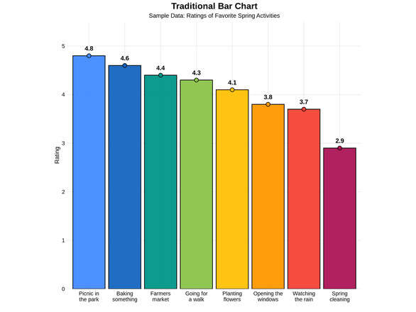
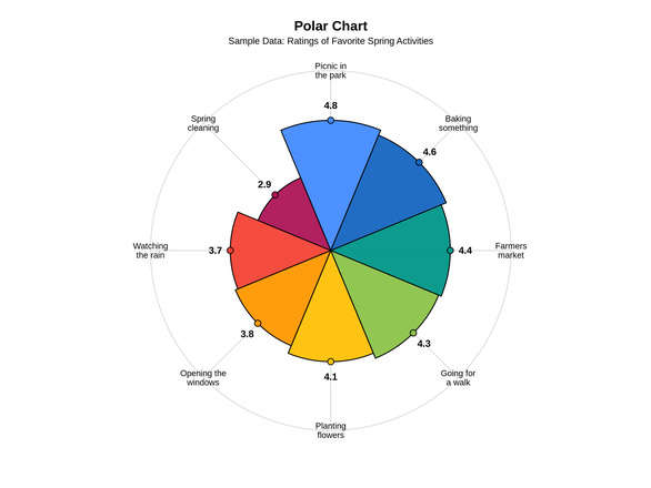
The above comparison illustrates this idea with a much lighter example. The polar chart and the bar chart show the same sample ratings of favorite spring activities using the same values and the same color ordering. In the polar version, the categories form a single overall shape, and the viewer’s eye is pulled toward the larger wedges and the broader outline of the figure. In the bar chart above, the same data are easier to compare precisely because the bars share a common axis and differences in height can be judged more directly.
This difference between the two types of charts is meaningful because it shows what each format does best. The bar chart above is stronger when the goal is straightforward comparison. A reader can quickly tell which categories rank higher or lower and estimate the size of the gaps between them. The polar chart presents those same values in a more unified form, encouraging the viewer to assess proportion of area rather than bar height. This is not necessarily better or worse, but instead guides the viewer’s attention differently.
This distinction matters in program evaluation, especially when the goal is to help people understand a pattern quickly. Sometimes evaluators want to highlight exact differences between measures, and a bar chart is often the clearest way to do that. In other cases, it is useful to communicate the overall shape of a set of ratings or perceptions. A polar chart can be effective in those situations because it gives the audience an immediate sense of balance and relative magnitude across categories.
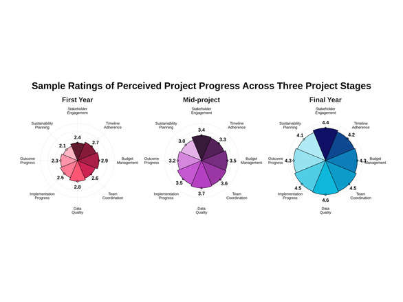
The example below extends the idea of the polar chart into program evaluation by showing ratings across three stages of a hypothetical project: First Year, Mid-project, and Final Year. Each chart uses the same categories and the same five-point scale, which makes the shapes directly comparable across time. As the project progresses and the ratings improve, the total area of the circle grows larger, indicating that perceptions of project progress are increasing over time.
This is one of the more interesting features of the polar chart. Rather than asking the reader to inspect each category one by one, the sequence of charts makes it clear that the project scope is expanding outward as metrics are fulfilled. The figure still allows category-level interpretation, but it also communicates growth at a glance. For evaluation audiences, that can be valuable because it combines detail with an overall sense of development.
Nightingale’s chart remains important for a reason. It reminds us that data presentation is not just a matter of decoration. The way findings are displayed shapes what people notice, what they remember, and how easily they understand the story the data are telling. Whether using a bar chart for clarity or a polar chart for overall form, the key is choosing the format that best supports the message you want the audience to see.
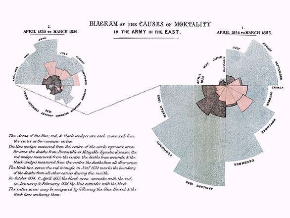
Florence Nightingale’s 1858 polar area chart showed that disease and poor sanitary conditions, not battle wounds, caused most soldier deaths in the Crimean War.
Don’t Be Fooled!
Understand the different types of validity and how to ensure your measures capture what they are intended to measure.
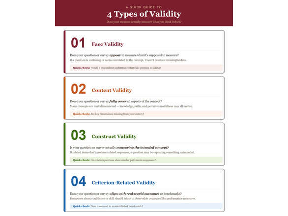
Earlier this year, we introduced reliability as the idea that a measure should produce consistent results. In the last issue, we shifted to validity, focusing on whether a measure captures what it is intended to measure. This month, we take the next step by breaking validity into different types and looking more closely at how to evaluate whether your instrument is actually doing its job.
It is easy to collect data. It is much harder to know whether that data is telling you what you think it is. In evaluation work, this is where validity becomes especially important. Without it, even well-designed surveys and carefully analyzed results can lead to conclusions that feel reasonable but are not well supported by what was actually measured. A quick visual summary of these four types is provided on the next page.
One of the most immediate ways to think about validity is through face validity. This simply asks whether a measure appears to capture what it is supposed to measure. This is often assessed by individuals with subject matter expertise who can connect the purpose of the survey to the questions and judge whether they align. If a question is confusing, too vague, or seems unrelated to the concept of interest, that is often apparent right away. While face validity is not sufficient on its own, it is a useful starting point. If participants or stakeholders cannot easily understand what a question is asking, the data collected from it will be difficult to interpret.
Content validity focuses on whether your instrument fully represents the concept you are trying to measure. Many concepts are more complex than they appear at first glance. Take program effectiveness as an example. It may seem straightforward, but it can include multiple dimensions, such as knowledge gained, skill development, and the usefulness of the program to participants. If a survey question focuses on only one of these areas, the results may reflect just a portion of the concept rather than the whole. Reviewing your items against your program goals and ensuring that each key dimension is represented is one of the most direct ways to strengthen content validity.
Construct validity goes a step further and asks whether your instrument is truly measuring the concept it is intended to measure, rather than something related but different. In an Extension context, for example, if a survey is designed to measure participants’ confidence in using food preservation practices after a workshop, the items should reflect confidence in performing those practices and not just satisfaction with the class or enjoyment of the instructor. One way to examine construct validity is to look at whether responses follow expected patterns in the data. For instance, survey items about confidence in identifying safe canning steps, using proper equipment, and following recommended processing times should be related to one another if they are all measuring the same construct. If those items do not relate as expected, it may suggest that one or more questions are unclear or are measuring something different than intended.
Criterion-related validity focuses on how well your measure aligns with an external benchmark or outcome that is relevant to the concept being measured. The goal is not for every measure to strongly relate to every outcome, but for it to relate to an appropriate criterion in a way theory would predict. For example, if a program aims to improve job performance, survey responses about confidence or skill should relate to relevant external indicators such as supervisor ratings or productivity measures. This type of validity can involve concurrent validity, where the measure relates to a current benchmark, or predictive validity, where it relates to a future outcome. While these comparisons are not always possible, they can provide stronger evidence that your instrument is capturing something meaningful.
Improving validity does not always require complex statistical techniques. In many cases, it comes down to thoughtful design and testing. Piloting your survey with a small group, asking participants to explain how they interpreted questions, and reviewing results for unexpected patterns can reveal issues early. Small adjustments at this stage can make a meaningful difference in the quality of your data.
In the end, validity is about trust. When you report findings, you are asking others to rely on your results to make decisions. Taking the time to ensure that your instrument measures what it is intended to measure helps produce accurate and meaningful information for decision-making.
Count Your Eggs
Explore how sample size and statistical power influence your ability to detect meaningful results in evaluation.
In earlier issues, we focused on whether our measures are consistent and whether they capture what they are supposed to measure. This month shifts to a different question. Even if your instrument is reliable and valid, is your study actually capable of detecting meaningful results? This is where statistical power and sample size planning come into play.
Power is about your ability to detect an effect if one truly exists. If your study has low power, you can do everything else correctly and still miss important findings. In practical terms, this means you might conclude that a program had no effect when, in reality, the study simply was not strong enough to detect it.
A simple way to think about this is through a coin flip. Imagine you are trying to determine whether a coin is fair or slightly biased. If you flip it only a few times, the results might look balanced even if the coin is not. With more flips, patterns begin to emerge. The same logic applies to evaluation. With too small a sample, real differences can be hidden by random variation.
Sample size is one of the main drivers of power. Larger samples make it easier to detect smaller effects because they reduce the influence of random noise. Smaller samples require stronger effects to stand out. This is why studies with very few participants often produce inconclusive results, even when there may be meaningful changes taking place.
There are trade-offs to consider. Increasing sample size improves power, but it also requires more time, resources, and coordination. At the same time, not all effects are equally important. In evaluation work, it is often more useful to detect changes that are meaningful for decision-making rather than very small differences that may not matter in practice.
This is where planning becomes important. An a priori power analysis allows you to estimate how large your sample should be before collecting data. This involves specifying the size of the effect you care about, the level of confidence you want in your results, and the expected variability in your data. Tools like G*Power can be used to estimate the sample size required to detect an effect with statistical significance under these assumptions. If you are unsure how to run a power analysis or interpret the results, feel free to reach out to Najat or me and we are happy to help.
In practice, even rough planning can make a difference. If increasing your sample is not possible, there are other ways to strengthen your study. Improving measurement quality, reducing unnecessary variability, or focusing on larger, more meaningful outcomes can all help increase your ability to detect real effects.
In the end, statistical power is about avoiding false negatives. It helps ensure that when a program is working, your study has a fair chance of showing it. Taking the time to think about sample size and power before collecting data can prevent situations where meaningful findings are missed simply because the study was not designed to detect them.
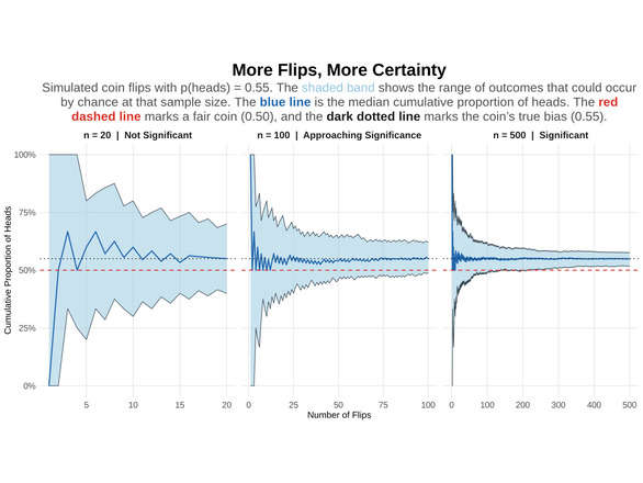
With more coin flips, results settle closer to the coin’s true bias, just as larger samples make real effects easier to detect.
Published by:
Copp, C. & Elgeberi, N., 2026, Evaluation Matters | 2026-04, Extension, University of Nevada, Reno, Newsletter
An EEO/AA Institution. Copyright © 2026, University of Nevada Cooperative Extension.
A partnership of Nevada counties; University of Nevada, Reno; and the U.S. Department of Agriculture