In this edition
- Spooky Stats and Peculiar Paradoxes
- Creepy Confidence Intervals
- Work Smarter Together
About Evaluation Matters
Evaluation Matters is a monthly newsletter published by University of Nevada, Reno-Extension. It is designed to support Extension personnel and community partners in building practical skills for evaluating programs, making sense of data, and improving outcomes. Each issue focuses on a key concept or method in evaluation and provides clear explanations, examples, and tools that can be applied to real-world programs.
See your data in a new light. This issue explores how hidden patterns can mislead results, how to measure uncertainty with confidence intervals, and how thoughtful collaboration helps teams work smarter together.
Spooky Stats and Peculiar Paradoxes
Learn how strange statistical patterns like Simpson’s Paradox, Survivorship Bias, and Selection Bias can trick evaluators and distort results.
Sometimes data can mislead. A pattern looks clear, a conclusion feels certain, and then something changes when we look at our data in a different way. In evaluation, these moments can be spooky! Like a creak in an old house, sometimes there are signs that something beneath the surface deserves another look. Three statistical phenomena can be responsible for such surprises: Simpson’s Paradox, Survivorship Bias, and Selection Bias. Each can distort what your numbers say, leading to confident but mistaken interpretations if left unrecognized.

Even clear data can conceal hidden stories.
Simpson’s Paradox occurs when a relationship that appears in the overall data reverses or disappears once the information is separated into groups. Imagine a chart showing a downward slope between two variables, perhaps suggesting that higher participation hours lead to lower satisfaction. The pattern looks clear, but when the data are broken out by subgroup, the relationship reverses, and within each group, satisfaction actually increases with participation. The apparent decline comes from combining groups of different sizes or characteristics, which hides what is happening within them. In evaluation, this might occur when statewide data show a decline even though most regions or populations experienced increases. The original pattern wasn’t technically false, but it was incomplete and distorted by aggregation.
This phenomenon can be observed by looking at the pair of visual aids on page 2. The first scatterplot displays a single trend line fit to the data inclined downward, a negative correlation. As X increases from left to right, Y decreases. The second scatterplot separates the same data into groups identified by color, and now each group shows an upward slope or a positive correlation. What looked like a single pattern turns out to be several smaller ones layered together. When one larger group pulls the overall average in one direction, the combined result can sometimes misinterpret what happens within the individual components. For evaluators, the lesson here is to look beyond the summary figures and test whether patterns hold across subgroups. Sometimes, what first appears to be a valid and reliable conclusion can change once we examine the data in a different way.
Survivorship Bias presents a different kind of problem. It appears when we base conclusions only on remaining participants and forget about those that have been lost along the way. This bias leads us to focus on the programs that succeed, the participants who complete a course, or the organizations still operating, while ignoring those that dropped out in the process. In an evaluation, that can make results look stronger than they really are. By studying only the survivors, we risk missing the reasons others fell away, and the barriers, challenges, or contextual factors that shaped our outcome. The missing data are not just gaps… they are part of the story!
A well-known historical example illustrates this idea. During World War II, analysts examined aircraft returning from combat to decide where additional armor should be added to aid in the survivability of their planes. They mapped bullet holes on the surviving planes and initially planned to reinforce the areas of the returning planes that had the most damage. Can you see the problem with this strategy? One statistician observed that those hole positions came only from the planes that survived. The aircraft that never returned had been hit in other, more vulnerable places, areas without a single bullet hole on the surviving planes.
The story has since become legend, and while some details may be apocryphal, its lesson endures. What we see in the data is not always where the danger lies. In evaluation, the missing responses, incomplete records, and vanished participants often hold the key to understanding what really went wrong. When this happens, it helps to look for patterns in who is missing, compare their characteristics to those who remain, and document how those gaps might influence the results. Further, you might attempt to obtain qualitative data from those participants who dropped out along the way.
Selection Bias, the last of the three phenomena presented here, occurs long before analysis begins. It creeps into evaluation when the people or organizations that participate differ in important ways from those who do not. A survey might draw mostly from participants who are enthusiastic to respond. A workshop evaluation might include only attendees who show up to a particular session. An event might be promoted only through Extension mailing lists, reaching people already familiar with and favorable towards the organization. When that happens, the results reflect the views of the selected participants rather than the larger population. In practice, this can make a program look more successful than it really is. For example, a program might look like it worked for everyone, when in reality the researchers captured only the voices of those who benefited.
Consider an evaluation of a professional development series where feedback forms are optional. Those who enjoyed the training, who are more agreeable, or who are in a better mood are quick to respond, offering glowing comments and high ratings. Those who felt the series was irrelevant or confusing are less likely to take the time. The report that follows is filled with praise, supported by charts of positive responses, yet it represents only those who already felt satisfied. The missing perspectives, if gathered, might tell a very different story. Recognizing this pattern requires evaluators to ask who participated, who did not, and how that imbalance might skew the results. When this occurs, evaluators can adjust sampling methods, seek targeted follow-up from underrepresented groups, and interpret findings cautiously to avoid overstating conclusions.
Simpson’s Paradox, Survivorship Bias, and Selection Bias each remind us that data can be deceptive when we stop questioning what lies beneath the surface. These phenomena, and others, can be the tricksters of the statistical world. But unlike the ghouls and ghosts that visit us this time of year, these are nothing to fear! By asking who is missing, what is hidden, and how patterns might change across groups, we can bring clarity back to the data. When viewed with care, even the spookiest dataset can reveal its truth, turning numbers that are haunted into valuable insights.
Creepy Confidence Intervals
Learn how to recognize and measure uncertainty instead of letting it lurk unseen in your results.
Confidence intervals are one of those statistical ideas that sound more complicated than they are. Often presented in brackets alongside averages or p-values, they describe how confident we can be in an estimate based on sample data. A confidence interval outlines a range of values that are consistent with the data collected. Confidence intervals might seem creepy to people unfamiliar with the concept, but they help us understand how precise our estimate is and how much uncertainty remains.
At its core, a confidence interval is a range of values drawn from sample data that is likely to contain the true value in the population. It does not tell us the true population value directly; instead, it tells us where that value probably lies based on the data we collected. One way to discover where the true population value lies is through repetition. If we were to collect new samples over and over again using the same method, a certain proportion of those intervals would contain the real population value. When statisticians say they have a 95% confidence interval, they mean that the method used would successfully capture the true value in about 95 out of 100 similar studies.
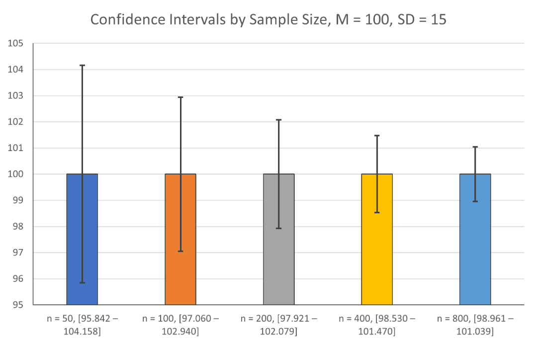
For example, the table to the upper-right shows the years of education of an Extension sample. Given the mean, standard deviation, and sample size, we can derive confidence intervals. In the output, the average number of years of education is 13.28, with a 95% confidence interval between 12.94 and 13.61. In other words, if we repeated this study many times using the same method, about 95% of our confidence intervals would include the true average years of education for all participants in the population. While the mean of the sample is used to approximate the mean of the population, confidence intervals tell us how certain that estimate is likely to be.
The width of a confidence interval gives us a sense of precision. A narrow interval suggests we have strong evidence for where the true value likely falls, while a wide one suggests more uncertainty. This width depends on both the size of the sample and the variability of the data. A large, well-collected sample tends to produce tighter intervals, while a small or highly variable sample will produce broader ones. As sample size increases, confidence intervals become narrower, showing greater precision (as the mean and standard deviation are held constant). Confidence intervals give us a way to judge how much trust we can place in an estimate’s precision. They remind us that every estimate carries some uncertainty, but that uncertainty can be measured and managed rather than ignored.
Many people interpret confidence intervals incorrectly. It is tempting to think that a 95% confidence interval means there is a 95% chance the true value is inside the range we calculated. That sounds correct but is not exactly true. Once an interval is calculated, the true population value either is or is not inside the range; probability no longer applies to that single instance. The 95% reflects how reliable the method is over many repetitions, not the odds that our current range “contains the truth.” It is also easy to assume that the middle of the interval, such as the mean, is the most likely value, when in fact the true value can be anywhere within the entire range. Understanding this distinction helps prevent overconfidence in results that appear precise but rest on statistical methods that still have room for error.
For evaluation work, confidence intervals are most helpful when comparing groups or tracking change over time. They remind us that every estimate comes with uncertainty and that apparent differences in averages may not be as large as they first appear. Two programs might report different average outcomes, but if their confidence intervals overlap, the difference between them may not be meaningful. Conversely, if those intervals are distinct, the evidence for a real difference becomes stronger. In this way, confidence intervals help evaluators interpret patterns more cautiously and communicate findings with greater accuracy.
Confidence intervals also improve how results are shared. Reporting an average alone can make data seem more certain than it really is. Including a confidence interval gives that uncertainty a voice, helping readers understand both the strength and the limits of what the data can tell us. Saying “the average score was 4.5, with a 95% confidence interval between 4.2 and 4.8” conveys far more information than the number alone. It allows others to see not just the result but also the level of confidence we can reasonably place in it. This openness about uncertainty is not a weakness in reporting. On the contrary, it builds credibility and trust.
Confidence intervals may seem creepy at first glance, but their purpose is straightforward. They acknowledge that we don’t know the full truth, only a range of values supported by the evidence we have. Far from being something to fear, they make our conclusions stronger by grounding our results in transparency. In a field filled with complex data and competing interpretations, confidence intervals are a quiet reassurance that uncertainty can be measured, managed, and even appreciated. In the end, they might not be so creepy after all!
Work Smarter Together
Explore simple strategies to make collaboration clearer, steadier, and more productive for everyone.
As the days grow shorter and projects begin to pile up like fallen leaves, it is a good time to think about how we collaborate together. Collaboration can be one of the most rewarding parts of a project, but also one of the most complicated. Everyone brings their own habits, systems, and preferences. Developing a good team takes planning, coordination, and a bit of patience. Whether you are writing a report, managing data, or planning an event, working smarter together means finding a balance between independence and interdependence.
Every project can benefit from having a shared roadmap. Before diving into work, take a few minutes to write down what needs to be done, who will do it, and when. It can be as simple as a short table in a shared document or spreadsheet. Having one place that lists deadlines, responsibilities, and progress helps everyone see how their piece fits into the whole. It also prevents the common trap of two people unknowingly working on the same task. For evaluation projects, a shared roadmap might include data collection dates, report deadlines, or task assignments. While it might take some initial time to set up, the clarity a shared roadmap brings will often save more time than it requires to develop.
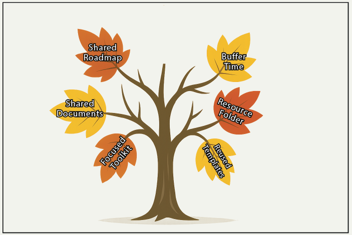
Shared plans and simple tools keep projects on track.
On a related note, even the best-laid plans need breathing room. Projects rarely adhere perfectly to a schedule, and packing schedules too tightly can leave little room to adapt. Adding a few buffer days between major milestones can turn predictable delays into scheduled pauses rather than last-minute scrambles. The habit of leaving space in the calendar makes collaboration feel steadier and less reactive. When several people are working on connected tasks, that extra time gives everyone room to catch up, revise, or clarify before moving on.
Additionally, shared documents can turn collaboration from a bottleneck into a time-saver. Instead of trading attachments by email, work directly in a shared file where everyone can see changes in real time. This approach prevents confusion and cuts down on the “which is the current version?” guessing game. Tools like Google Docs or Microsoft 365 support real-time editing, while project management platforms such as Monday.com and Asana can help teams organize tasks, deadlines, and communication in one place.
Another helpful habit is creating a shared resource folder for each project you are working on. Having a single location for notes, resources, and key information saves time and keeps everyone on the same page. Whether it is a shared folder on Google Drive, OneDrive, or Box, or a simple folder on the shared network, having one reliable place for collected project knowledge can make teamwork easier. When someone new joins the project, they can get oriented quickly without relying upon other team members to get them up to speed. For evaluation projects, this shared space might hold survey instruments, data dictionaries, project documentation, and draft reports. A shared resource folder turns scattered files into an organized archive that the whole team can rely upon.
While this article has mentioned a variety of programs to use, teams also work better when they resist tool overload. Every platform promises to make collaboration seamless, but too many systems create confusion instead of clarity. For most projects, a handful of tools will suffice: one tool for team communication, one for task tracking, and one for file sharing and document collaboration. A small toolkit used effectively is far more efficient than a long list of platforms no one remembers to check. A little restraint keeps everyone in sync and reduces the time spent hunting for information across multiple apps.
Finally, efficiency grows when teams reuse what already works. Reusing report templates, adapting past surveys or interview guides, and drawing from prior email drafts can save hours of repetitive effort. Instead of reinventing the wheel each time, teams can focus on other tasks that might be more beneficial to project success. Adapting previous work ensures that materials look professional and are of high quality while saving time and energy.
Working smarter together is not about squeezing more work into less time; it is about making collaboration less complicated and more intentional. Clear plans and shared spaces help teams stay coordinated and focused. When everyone knows where to look, how to contribute, and what to expect, projects move forward with less friction, and when teams plan and organize early, they avoid unnecessary stress and can focus on what matters most. A little effort spent planning now will pay off later, when projects stay on track and collaboration feels easier for everyone involved.