Evaluation Matters | 2025-08
In this edition
- What’s Wrong With This Chart?
- Setting SMART Goals for Purposeful Planning
- Presentations That Stick: Tailoring Your Message to Your Audience
About Evaluation Matters
Evaluation Matters is a monthly newsletter published by University of Nevada, Reno-Extension. It is designed to support Extension personnel and community partners in building practical skills for evaluating programs, making sense of data, and improving outcomes. Each issue focuses on a key concept or method in evaluation and provides clear explanations, examples, and tools that can be applied to real-world programs.
This issue, published in August 2025, shows how to design charts that communicate without confusion, turn vague intentions into concrete plans using the SMART framework, and tailor presentations so the right message resonates with the right audience.
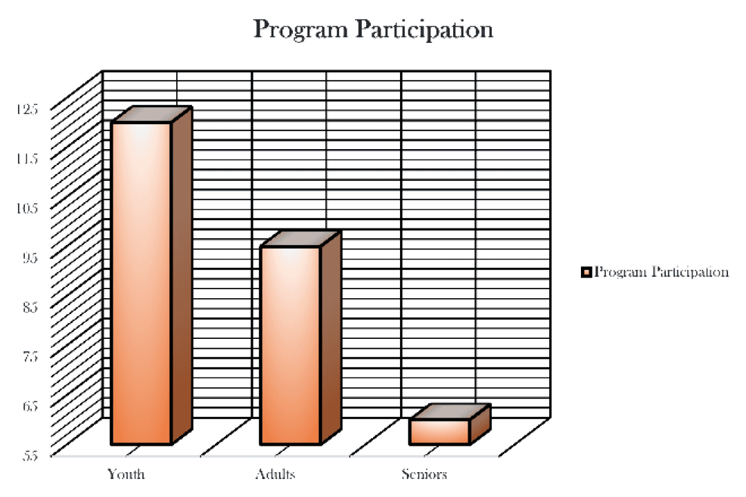
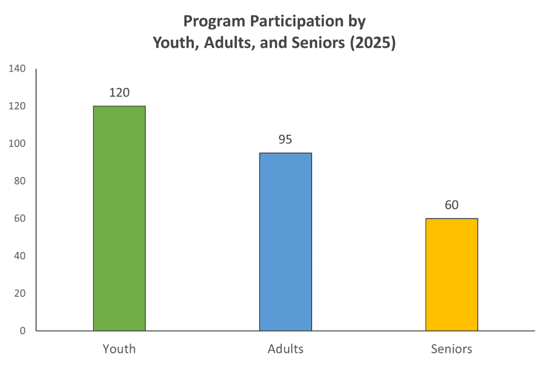
What’s Wrong With This Chart?
Learn how to design charts that communicate clearly, avoid common pitfalls, and make your data easy to understand at a glance.
A good chart is like a lesson in condensed form. Just as a lesson is only useful when it is clear, a chart should distill complex information into something that can be understood quickly. At a glance, the viewer should grasp what the chart is showing and remember its main point later. The best charts do not make the audience work to uncover their meaning. Instead, they make that meaning obvious through thoughtful, deliberate design.
Start with the basics. Label your axes clearly, choose an appropriate chart type for your data, and keep the layout minimal. Remove decorative elements that add no informational value, such as 3-D bars, gradient shading, or ornate fonts. Limit your color palette to a handful of distinct colors, avoiding shades so similar they are hard to tell apart. Use data labels to indicate values when helpful. If the legend is unclear, revise it until there is no ambiguity, or remove it altogether if the chart is understandable without it. Think of your chart as visual shorthand for your results. The simpler and cleaner the presentation, the stronger the communication.
A concise, descriptive title is also essential. The title should state what the chart shows rather than naming only the subject. For example, a vague title like “Sales Data” tells the reader little, while “Quarterly Sales Increased 15% in 2024” gives the audience a clear picture, and “Quarterly Sales Grew 15% in 2024, Driven by Online Orders” provides even sharper focus. Including a time frame and location when relevant strengthens the title further, as does avoiding jargon or unexplained abbreviations that may confuse the audience. The tone of a title should also fit the purpose of the chart: precise and neutral in an academic setting, more action-oriented and engaging in a presentation. Titles should remain short enough to be read quickly but specific enough to avoid vagueness, generally around eight to twelve words.
For most numeric charts, starting the scale at zero is best practice because it avoids distorting the perceived size of differences. If you choose a non-zero baseline, do so intentionally and explain why. Narrowing a scale to exaggerate differences is generally poor practice. Ensure your scale uses appropriate units and is logical for the subject. For example, avoid decimals when counting numbers of people. Match scales across related charts so comparisons are accurate. Consistency in how numbers are displayed is essential for clarity.
Consider the context in which the chart will be used. A presentation slide may require large fonts, a simplified structure, and minimal text for easy viewing at a distance. A report may need more detail and labeling for close reading. If the chart will appear in a professional report, export it at high resolution so text and lines stay sharp in print and on high-resolution screens. Low-quality images can make even the best-designed chart look careless and hastily thrown together.
A well-designed chart is like a strong lesson plan. It guides the viewer from question to understanding in as few steps as possible. By focusing on clarity, simplicity, and accuracy, you help ensure your audience leaves with the message you intended.
Setting SMART Goals for Purposeful Planning
Turn vague intentions into concrete, achievable plans using the SMART framework to guide your work and track success.
At the beginning of a school year, many people set goals for themselves. Some aim for straight A’s, some may want to join a club or improve their public speaking, while others simply want to be on time. These goals often work because they are concrete, measurable, and motivating. In program evaluation, SMART goals are especially useful because they provide a structured way to define objectives, measure progress, and demonstrate outcomes to stakeholders. A well-written goal is not just a wish... it’s a roadmap! But how does one formulate a good goal? That is where the SMART framework comes in.
SMART is an acronym for Specific, Measurable, Achievable, Relevant, and Time-bound. Each component works together to turn vague ideas into actionable commitments. A goal like “We want to improve outreach” may sound positive, but it is too vague to be useful. A SMART version might read, “Increase newsletter subscribers by 20 percent over the next three months.” Now the goal has a target, a timeline, and a metric by which to measure success.
Let’s start with the S. Specificity matters because it forces you to clarify exactly what you intend to accomplish. “Increase participation” is a start, but it leaves too much room for interpretation. Participation in what? Are you trying to get more people to attend events, complete a training, or respond to a survey? Being explicit not only helps you focus your efforts but also makes it easier to explain your goal to others.
Measurability ensures that progress is trackable. Without a way to measure success, you cannot know if you are moving in the right direction. Will you use attendance records, feedback forms, or survey responses? Choose measures that are both reliable and easy to collect so you can check your progress along the way.
Achievability is often overlooked, but it is essential. Goals should challenge you without being unrealistic. Trying to double your program’s reach in one month may sound ambitious but is unlikely to succeed. Instead, assess your available resources, time, and prior results to choose a target that is both ambitious and attainable.
Relevance ensures that your goal supports your broader mission and evaluation objectives. A goal that looks good on paper but does not connect to your purpose or priorities will feel hollow when it comes time to report results. Aligning your goals with your mission also helps justify your work to stakeholders.
Time-bound means your goal has a clear deadline. Without one, even the best goals can fade into the background. A date creates urgency and provides a natural point to evaluate progress. Saying “by December 31st” gives you a fixed marker for success and allows you to plan backwards from that date. If you reach the deadline and have not yet met the goal, you can still use what you have learned to refine your approach. In evaluation, deadlines can also help synchronize your goals with funding cycles, program milestones, or reporting requirements.
SMART goals do more than keep you organized. They can make your evaluation work more persuasive as well as methodologically sound. They show stakeholders that you are intentional about your objectives, that you have a clear plan for achieving them, and that you are prepared to measure and report on your progress. They also make it easier to celebrate success. Instead of a vague feeling that “things are going well,” you will have concrete evidence that you accomplished what you set out to do. Over time, consistently setting and meeting SMART goals can build a culture of focus, accountability, and improvement within your organization.
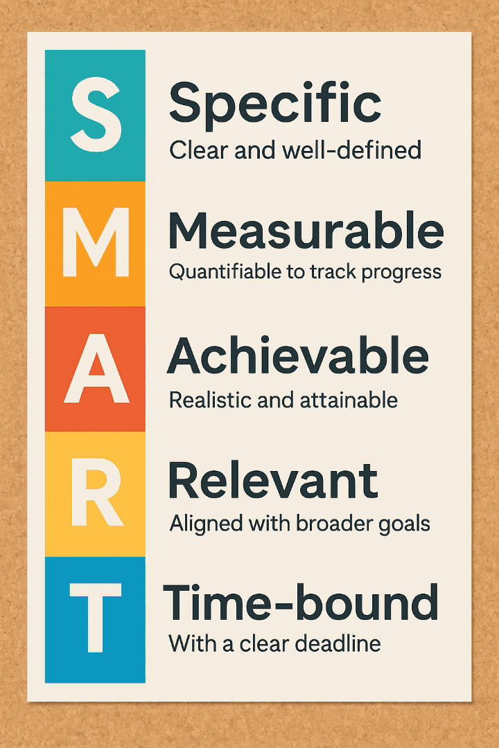
SMART Goals can help your project succeed!
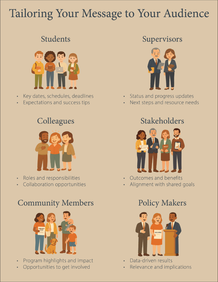
Presentations That Stick: Tailoring Your Message to Your Audience
Discover how to adjust your delivery so your message connects with students, colleagues, supervisors, and stakeholders alike.
If you work in a school or university setting (this might apply to a handful of you), you already know how many different hats you can wear in a single day. You might present program results to stakeholders in the morning, meet with students about their academic progress midday, and brief your supervisor on upcoming objectives in the afternoon. Each of these meetings calls for a different approach. The information you choose to highlight, the language you use, and the tone you take all depend on who you are speaking to and what you want them to remember. This is what tailoring your presentation is about: adjusting your delivery so your audience understands it, values it, and acts on it.
Tailoring your presentation does not mean changing the facts. It means deciding which details to emphasize and how to frame them so they resonate with your audience. A supervisor may want a streamlined summary of results, key next steps, and clear ties to project priorities. Stakeholders might respond best to outcomes framed in terms of community impact. Colleagues often need to understand how an initiative will be implemented and what role they will play. Students may care most about schedules, deadlines, exams, or assignments. The emphasis and framing of your message shift depending on who is listening, because prioritizing what matters most to your audience makes your presentation more relevant and engaging.
Once you know which points to emphasize, shape your presentation so those ideas stand out. Keep the structure clear, moving from the most important points to supporting details in a logical sequence. Use visuals that highlight rather than compete with your message. Vary your pacing to sustain interest, slowing down during complex sections so your audience has time to absorb difficult ideas. Include moments that check for attention, such as a brief example, a quick poll, a question, an exercise, or a well-timed visual change. The goal is to make your delivery as intentional as your content, ensuring that your audience stays engaged and retains what you share.
One highly effective way to make a presentation stick is to design it for memory. People rarely remember every detail, but they tend to recall a few clear, well-structured points. Limit your main takeaways to three to five key ideas and reinforce them throughout your talk. Open by previewing your results, present them in detail, and then summarize them again at the end. Use narratives, quotes, or striking graphics to make important points memorable. These techniques help anchor your key messages so they are retained long after your presentation ends.
When you take the time to match both your content and your delivery to your audience, you dramatically increase the likelihood that your presentation will be remembered and acted upon. Whether you are speaking to students, colleagues, stakeholders, or supervisors, a presentation that resonates connects the right message to the right people in the right way. And when your presentation sticks, your audience is far more likely to use what they have learned.
Published by:
Copp, C. & Elgeberi, N., 2025, Evaluation Matters | 2025-08, Extension, University of Nevada, Reno, Newsletter
An EEO/AA Institution. Copyright © 2026, University of Nevada Cooperative Extension.
A partnership of Nevada counties; University of Nevada, Reno; and the U.S. Department of Agriculture