In this edition
- Fireworks or Duds? Using Effect Sizes to Tell When Your Results Really Matter
- Don’t Get Burned: Common Statistical Mistakes to Avoid
- Independence From Online Survey Platforms: Designing Paper Surveys That Work
About Evaluation Matters
Evaluation Matters is a monthly newsletter published by University of Nevada, Reno-Extension. It is designed to support Extension personnel and community partners in building practical skills for evaluating programs, making sense of data, and improving outcomes. Each issue focuses on a key concept or method in evaluation and provides clear explanations, examples, and tools that can be applied to real-world programs.
This issue, published in July 2025, explains how to look beyond p-values by using effect sizes, highlights common statistical pitfalls to avoid, and shares practical guidance for designing clear paper surveys that gather reliable responses.
Fireworks or Duds? Using Effect Sizes to Tell When Your Results Really Matter
Look past statistical significance to judge the real-world importance of your findings.
Every Fourth of July, the sky fills with lights and sounds. Most bursts are dazzling, while occasionally some fizzle without even a pop. In evaluation, your results can behave much the same way. Some of your trends might seem exciting at first glance, but a closer look reveals they aren’t particularly meaningful. Others may appear modest but might carry real implications for programs, policies, or people. The key to knowing which results deserve attention is learning to distinguish statistical significance from practical significance.
Statistical significance tells you whether a result is likely due to chance. When you see a p-value below 0.05, it typically signals that the observed effect is unlikely to have occurred randomly. That might feel like a reason to celebrate, but it’s important to dig deeper. Statistical significance doesn’t measure how big or important the effect is, only whether it appears consistently enough in your data to be considered real. A p-value helps determine whether two groups likely come from separate underlying distributions, rather than being random variations within the same group. This distinction is useful, but limited. You can observe a very small difference that is statistically significant, especially with a large enough sample, and yet that difference may not matter much in practical terms.
That’s where effect size comes in. Effect size tells you how strong or substantial the relationship or difference really is. Unlike a p-value which answers “Is the effect there?”, effect size answers “How much does it matter?” It gives you a sense of the scale of the result, whether it’s a little pop or a big bang. Think of it like volume: statistical significance tells you if a sound exists at all, but effect size tells you whether it’s a whisper or a roar.
One of the most common measures of effect size is Cohen’s d, which expresses the difference between two group means in standard deviation units. A popular rule of thumb is that a Cohen’s d of 0.2 indicates a small effect, 0.5 a medium effect, and 0.8 a large effect. These categories provide a rough sense of how far apart the groups are in practical terms.
A difference in effect size reflects a different degree of separation between groups. In the accompanying visual, all three plots could have identical p-values, yet the amount of overlap between the two groups is dependent upon the effect size. The magnitude of this difference is what turns statistical noise into practical meaning.
Measurements of effect size come in different forms depending on your analysis. When comparing group means by using a t-test, one might use the aforementioned Cohen’s d, which expresses the size of the difference in terms of standard deviations. For relationships between variables, such as in correlation, an R² value can show how much of the variation in one variable is explained by another. Additionally, standardized beta coefficients help indicate which predictors carry more weight in regressions. No matter the method, effect size can often be your best guide for understanding real-world implications.
So how do you tell when your results really matter? Look beyond the p-value. Ask whether the effect size is large enough to be meaningful. Think about the context in which the result will be used. A small improvement in graduation rates could affect hundreds of students. A modest drop in anxiety could make a world of difference for struggling parents. Real fireworks in evaluation are the ones that shift behavior, inform policy, and improve lives... not just the ones that show up with asterisks in a table.
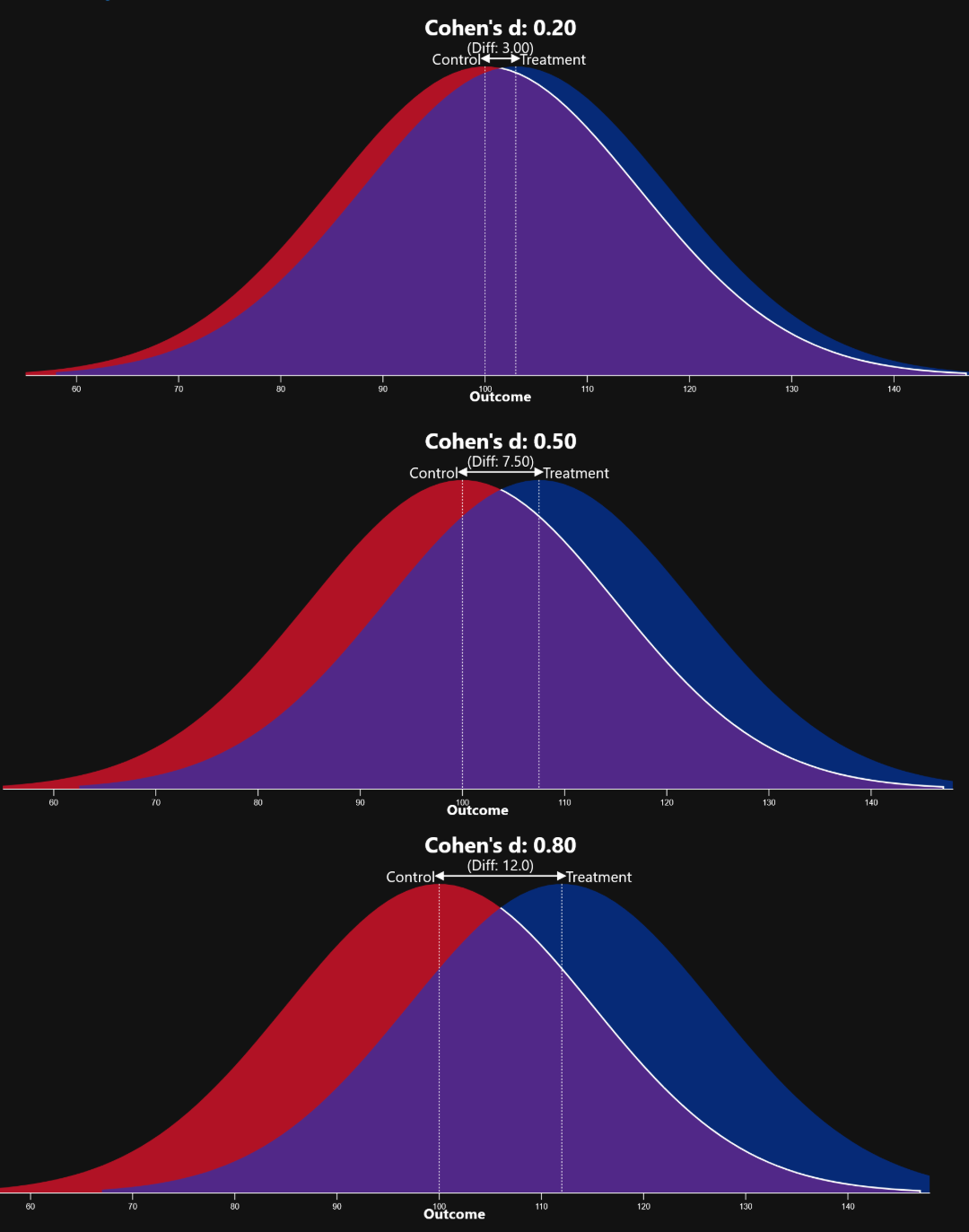

Effect sizes can help determine whether your program is a pop or a fizzle!
Don’t Get Burned: Common Statistical Mistakes to Avoid
Keep your analysis on solid ground by avoiding frequent pitfalls.
A good summer barbecue requires planning, timing, and attention to detail. Undercook the chicken, and you’ll regret it. Oversalt the burgers and nobody wants seconds. Working with data is no different. Even with the best ingredients, small mistakes can quickly spoil your analysis. Whether you’re evaluating a program or presenting findings to stakeholders, knowing which missteps to avoid can be just as valuable as knowing what to include.
One common mistake is assuming that correlation means causation. Just because two variables move together doesn’t mean one causes the other. For example, as a former crime analyst, I know that ice cream sales and crime both increase in the summer. However, that doesn’t mean popsicles cause burglaries! In evaluation, it’s easy to draw causal conclusions from surveys or administrative data without realizing that other factors may be at play. This kind of misstep can lead to inaccurate claims about what a program did or didn’t accomplish.
Small sample sizes are another danger zone, like trying to grill for a crowd with only three briquettes. When your sample is too small, the data can be noisy, unstable, and misleading. Small studies can still be useful, especially in exploratory work or when studying hard-to-reach groups, but their results should be interpreted with extra caution. Patterns that seem significant in a small group may disappear entirely with more data, just like a steak for one doesn’t scale up for a neighborhood cookout.
Ignoring the assumptions behind your statistical methods is another common pitfall. Every test, from t-tests to regression, comes with certain requirements: normal distributions, equal variances, or independent observations, for example. Violating these assumptions is like ignoring food safety rules at a picnic... it can get ugly! If your data doesn’t meet the conditions required for a method, the results might look delicious but turn sour under increased scrutiny.
Finally, overfitting is another issue that can quietly undermine your results. It occurs when a statistical model is too closely tailored to the dataset being analyzed, to the degree that the model reflects the random noise present in the specific dataset rather than meaningful patterns that can be applied more broadly. This often happens when a model includes too many variables, or if it uses overly complex techniques for the size of the dataset. While the model may appear to fit the data extraordinarily well, its performance on novel or unseen data is typically quite poor.
Just like cooking, statistical analysis rewards those who take their time, know their tools, and think carefully about each step. The goal isn’t just to avoid mistakes, but to serve something your audience can trust, understand, and use.

Don't get burned!
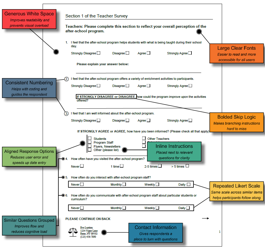
Independence From Online Survey Platforms: Designing Paper Surveys That Work
Build clear, user-friendly paper instruments that produce reliable responses.
Digital platforms like Qualtrics and SurveyMonkey have made survey creation easier than ever, offering features like automated skip logic and built-in analytics. But paper surveys still have a valuable role to play... particularly in settings where internet access is limited, technology comfort is low, or face-to-face distribution is preferred. A well-designed paper survey can yield high-quality data and feel more approachable for participants who might otherwise be hesitant to engage with digital tools.
Strong paper survey design starts with layout. Pages should feature generous spacing, large fonts, and clear section headers to make the content easy to navigate. Grouping similar questions, numbering them consistently, and aligning response options all help respondents stay on track and reduce the chance of error. Instructions should be placed as needed to avoid confusion. Small design choices like these can make the difference between a survey that is clear and one that gets tossed aside.
Response areas should also be structured with care. Using the same Likert scale across similar items keeps things consistent, while bolded skip logic cues make it clear when to move ahead or skip questions. Including contact information gives participants a place to turn if they have questions, which helps maintain trust and clarity.
For a breakdown of what works well, see the visual aid on the next page, which highlights features to include in a well-structured paper survey.